

The distribution of beginning farms reflects local farm economies
- by James Williamson
- 12/19/2014
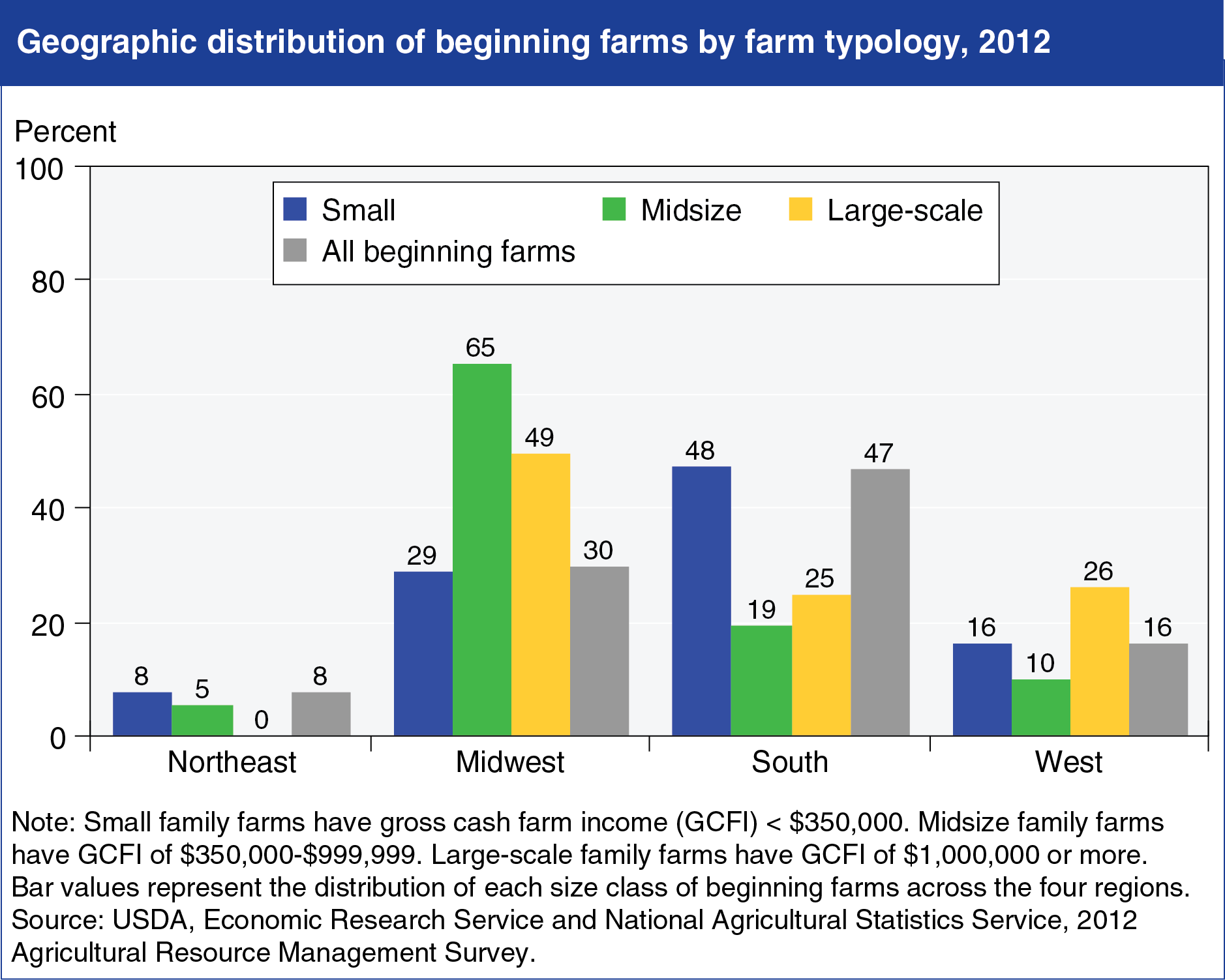
In large part, the regional distribution of beginning farms mirrors that of all farms, but there are some differences. Beginning farms are located all across the country, but overall, the South is home to the largest percentage of beginning farms: 47 percent, which is about 5 percent higher than its share of all farms. The South also has the largest percentage of small beginning farms. Large-scale beginning farms are most likely to be in the Midwest, but with 30 percent of the nation’s beginning farms, the Midwest has fewer than its 37 percent share of all farms. The concentration of cash grain farms in the Midwest, which on average are larger than farms specializing in other types of commodities, not only explains the region’s higher shares of mid-size and large scale beginning farms, but may also explain the fact that fewer of its farms are operated by beginning farmers. This chart is found in the ERS topic page on Beginning & Disadvantaged Farmers, updated October 2014.